Community Fibre were on a charge to solidify its position as London’s leading independent altnet through a brand refresh centred on reliability, affordability, and rapid expansion to over 1 million households. Our challenge was to develop their new visual identity into a flexible and versatile toolkit capable of working across all touchpoints.
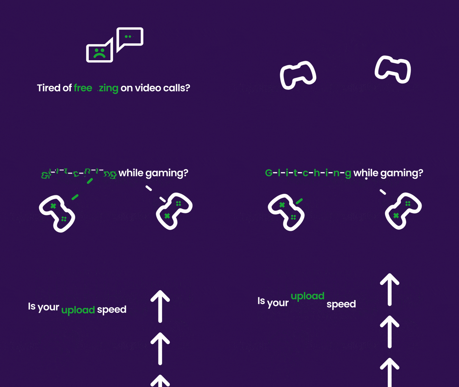
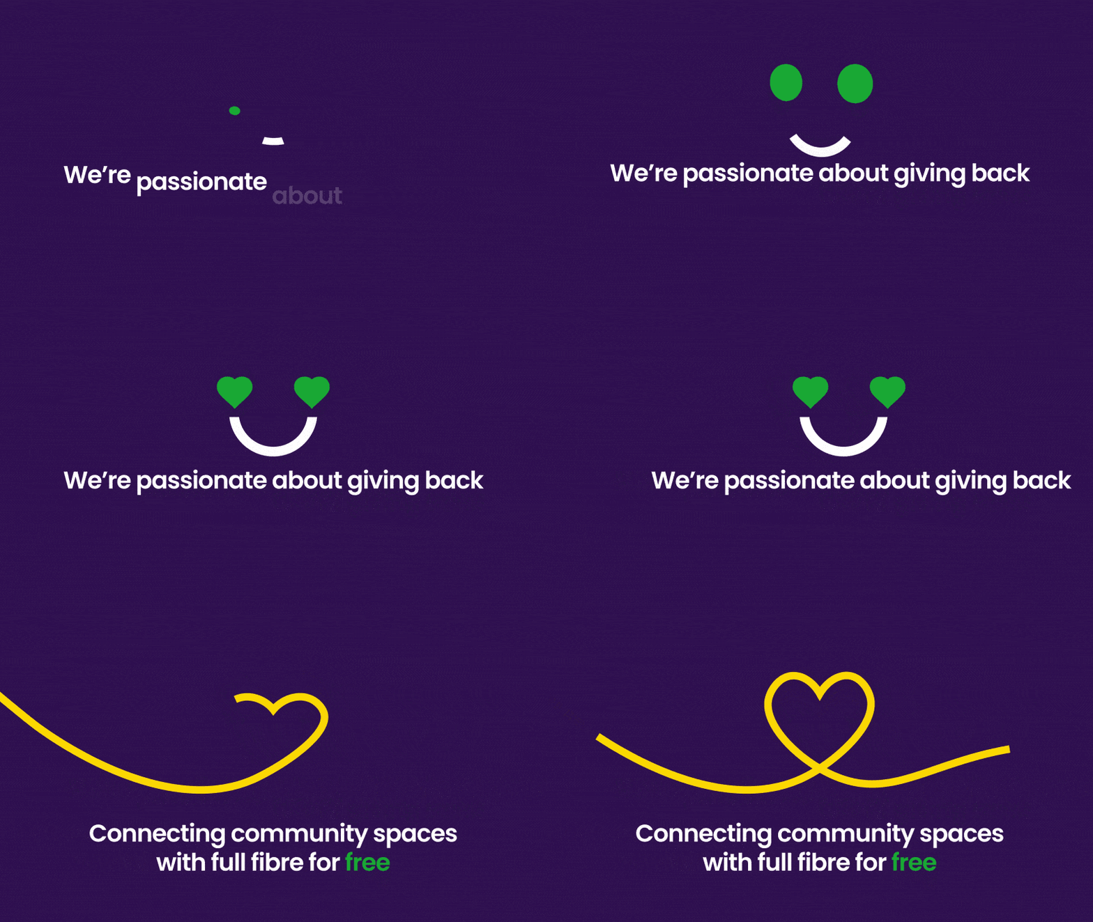
As part of the brand rollout, I created a set of comprehensive motion principles and guidelines which we applied across digital applications, including direct marketing, tutorials and explainer videos.

Core Principles
Together with Clare (the lead designer), we developed 4 core motion principles to help guide the motion rebrand through its development.
Together with Clare (the lead designer), we developed 4 core motion principles to help guide the motion rebrand through its development.
The principles were "Shockwave", "Pulse", "Rise" and "Rotate"

Shockwave

Pulse

Rise

Rotate


Logo Animation
As part of the rebrand, I was tasked to create a new logo animation for
Community Fibre.
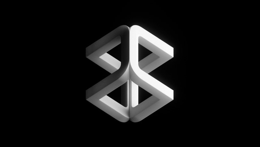
Here are some of the developments the logo went through before landing on the final version
Here are some of the developments the logo went through before landing on the final version













Final Logo animation

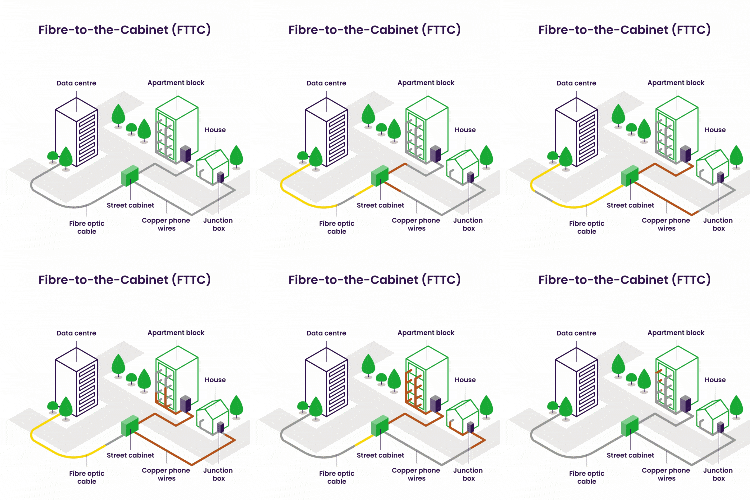
Explainer videos